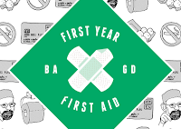
I changed the logo initially from the pink colour to black and white but this again didn't seem to work with the green background so i changed the black and grey parts to match the green...
I tried a green gradient across the plasters but again it didn't work as well as i would of hoped. I also tried the initial 'plus' ides but the cross worked better...
I finally settled on the green and white toned colour scheme. This seemed to work the best and would stand out against the green background as well as keeping to my clinical colour scheme and representing first aid.
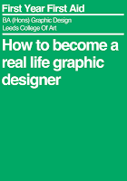
Next, I played around with front cover ideas for the hot-dog booklets. I wanted to keep the type simple on the front, as if it was replicating something medical, such as a box of tablets or instructions (or even a box of plasters). I tried adding the logo but this didnt work...
In the end, I went for this design for front and back covers of the 'First Aid' kit. I wanted to keep things simple so i made the title text smaller and just included the logo on the back of the book.
Moving onto altering my posters, I still wanted to keep the patterned illustrations but add a touch of the green colour and new logo to the poster somewhere. Here are some experiments...
I also created the design for the front and back of the box that the booklets will come in. A 'First Aid Box. I wanted to keep the design similar to the booklets but also involve the logo, so i came up with this. Simple, clean and works well with the theme of my product...


Leave your comment