Archives

Design Manchester _ 31/10/13

DM13

On thursday this week, I managed to get down to Design Manchester which is an originative week-long festival, celebrating creativity, collaboration and inclusivity in the worlds of art, design, illustration, animation and photography.

It was held within the condiments of the beautiful architecture of Manchester Town Hall, which made the event all that more special. The event was curated by ambassador Malcolm Garrett, and consisted of a series of inspirational talks, interactive workshops and evening events, on the theme of longevity, held within the town hall. The festival was kindly supported by GF Smith and Design Week which meant free goodies was on offer too! 

I was looking forward to the event as I was interested in hearing the opinions and stories of some highly recomened designers such as Mark Farrow and Peter Saville (my all time favourite designer) as well as some advice from upcoming, current and exciting designers like Kate Moross & Colophon Foundry. 


Notes

The theme for the fetival was "Longevity" and was looking at how design can be built to last. Timeless.


Andrew Shoben of 'Grey World'


Andrew Shoben is the founder of Grey World who create interactive Installations within the City. Here's a vide of him talking about it, like he did to us....


He was talking about how he liked "Public Art" and the fact that you have to break down the gulf and class separation in communicating with the everyday public, which is much like graphic design in general.


He thinks everybody should be generating quick ideas and ways to communicating and interacting with the public without a massive budget.


The audience is not un-educated or educated - ITS EVERYONE!


Park Bench 

He commented on how he liked working with park benches because thats the staple part of the public. You sit on it, eat your lunch, and the entire city is engraved on the bench.


He also talked about how people pre-determine what public art is. Public art is a bronze statue, something that represents history, but this needs to stop! and often if he's been commissioned a piece, the people have already pre-determined a "cross" on the floor where it will go.


Grey world is named after the "grey" places and creating work for them.

He likes the idea of making this random connection with strangers.

Interactive Public Art needs to have a clear name also to interact with the audience.

To create work that has longevity it needs to be clear, really simple and instantly connect with an audience.


Kate Moross


Kate Moross is an established graphic designer, illustrator and art director in her own right. She describes herself as a jack of all trades! and likes to keep pushing herself, experimenting, learning new things. "Blagging It" a bit. 

She believes you should do anything and everything you want to! Just do it! 

She mentioned how Myspace and MSN Messenger was the first thing that got her into coding and design. You could hack myspace and design it to anyway you wanted to. Which is true because this is the platform that i had first contact with coding and design for web if you like. 


She likes to "Make Music Look Good" and as she revolves around the music industry, she finds that this is her job title. 

She encourages Collaberation all the time! Thats the future! 

Promo CD's are the current way forward in music. Everyone needs a promo magazine. Not evenyone can afford to produce vinyl - it's expensive. 

She also has moved into creating music videos for artists and "visualisers" which is basically a music video with no people in. 

The Insect video she made or Simian Mobile Disco cost around £350 to make. 

Both music and Design is about "illusion"

MAKE YOUR OWN LUCK!

Have No fear, Failure is Important. 
Sometimes things don't happen for you, just keep going! 

If you don't know how to do something, LEARN IT! why not? nothings stopping you. 

IMPROVISE!

Be open with clients and collabertors. Let them know exactly what you want to do and give them your ideas from the start. Be honest!  Put it all on the table. 

Your not a STUDENT, Your a DESIGNER!

Over-deliver every time and consistantly. Smash it! Don't be lazy! 

Artwork becoming an exhibition and part of the surroundings (good for interactive briefs)


Colophon  Foundry 


Their name means "The Friendly Understanding" which represents each other and their clients. 

Collaborators are:

Benjamin Critton
Studio Mackgill 
Alsion Haigh
Anthony Burill 


Relative Faux - A Monospace Typeface (each character is same width)

Pitch 11, 12, 13 which means how many characters are in an inch. 

Each letter from Light to Bold takes up the same space, just gets darker and bolder. 


Apercu - First Full Type Family 

Apercu is inspired by Gill Sans, Franklin Gothic, Johnson.  They take this classic fonts and hint at something new by remoulding them. 

Creating a small spec catalogue was important to create some sort of physical way of displaying rather than just a typeface digital download. 


Apercu Type Spec book. Really nice! 


Type Spec Books with Type measuring guide and a pack of 'things'.


SCION GALLERY 

Typeface based on stencils - Monsten - Monspaced Stencils

Based on the Plastic Stencils you get as a kid. 


Laser cut massive floor rug with the idea of kids ruining the floor underneath. 

Idea to make "Hidden" typeface that can be printed with pop out stencils - GOOD IDEA!

Value Sans & Value Serif - Value Serif is based from drawing over the top of value sans to create a new typeface.

Castledown - an alternative to comic sans - a typeface for children. based on joined up handwriting aiming to learn kids how to write. 


Mark Farrow 

Teenage hobby of collecting tropical fish. He used colours found on tropical animals that you wouldn't normally put together to create colourways in design - Interesting Idea. 

His interest in music come before his interest in design. He worked in record stores that people like tony wilson and peter saville used to nip in - got into it that way. 


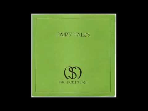
Formed alliances at the record shop and was asked to do a record sleeve for "Stockholm Monsters - Fairytales" 

- for this he found old typefaces in books in the library and cut them out and merged together. Made a couple of letters himself that he couldn't find. 

He says theres no rivalry between him and Peter Saville - there never was.They was four years older so he sort of looked up to them. 

He wasn;t cut out for college and learning - wasn't cut out for working in a studio that didnt belong to him. 

He worked for a bit at some studios in london  with the idea that he'll do the work much better than anybody already there. 

Got a Pet Shop Boys link through is first job. He went against the grain of what was happening at the moment by creating a plain white cd cover with minimal packaging. 


PSB - YES was fundamentally made for an iphone and itunes logo so had to be not intricate. simple in design. 

Each box represents a different track. 


Created this idea of medicine through music. Cd's was popped out of a big pill packet. this all stemmed from the quote 

"Music is medicine for the soul"

He could have fun with the copy and stuff for example "IF this docent work try this (another album)"


Self Branding _ Business Cards

I recently made some Business Cards myself as a last minute effort before visiting Design Manchester, which is a new Design Festival in Manchester, which I figured might be a great place to network and that's impossible without some sort of Business Card to hand out.

As I'd changed my self-branding from last year, I wasn't comfortable in handing out my old business cards, which is why I created these. They are triplex printed on bright white and pure black stock. They are laser printed which is not ideal, but okay for a last minute job. I don't want to spend a lot of money getting my business cards sent out to a printers, just incase I fall out with my branding before now and the end of the year, so these will do for now.


Triplex Printed


PPP Presentation

10 minute presentation


The Start of year presentation is split into three main sections;

- Interning
- Briefs
- COP3


Interning

To start the presentation I talked very briefly through some of my work created during my 6 week placement at Uniform Brand & Communications Agency, based in Liverpool and then went on to look at some important things I've learnt whilst being with uniform.


Briefs

I talked through the main selected 8 briefs that I'm taking on this year with a brief overview of the brief title and objective as well as some imagery to show some background information on each of the briefs I'm taking on, along with visuals and ideas on where the creative challenges will be and what they might lead to.


COP3

The third and final section of the presentation was discussing COP starting with my dissertation question and splitting off into the 5 main sections of research that I have been undertaking over the summer; including visual aids to help explain. I finished the presentation with explaining a brief idea of what I might create from this research on the practical side of my dissertation; brand guidelines.


OUGD502 - Final Website - Coded

Today I managed to get my website coded properly. I had to take a slightly different approach than my original concept just for the meantime. I needed to create something that I was capable of coding myself for now, before I may outsource for a better one in the future.


The conept for this was simple. I wanted a yellow nav bar the the bottom left of the page with a full bleed slideshow of images in the background.


The website folder has the three pages in there. Home (Index), About and Contact. There is also three more links in the nav bar which is to twitter and behance and a interactive PDF which pops up. 


Here is the image folder for the website. It contains all the buttons as separate images and for the rollover images and also all the images for the moveable slideshow in the background. 


Working with screen sizes


I found the javascript for the slideshow which meant that the website would work on different sized screen with the optimum being 1980 x 2000 pixels.


13" Screen


22" Imac


The about and contact pages are boxes that flip up from the nav bar then close when you click back on home. 


As I haven't bought a domain yet, the website isn't live, but i;m planning on making it live over the next few days...


OUGD502 - Self Branding - Printed Products

The Final range of initial printed stationary includes the letterhead, business cards and moleskine notebook;


To create the business cards I wanted to use the textured stock as a backdrop for the yellow colour to sit on, as shown in my initial designs and mock ups. By doing this, it brings something a little bit different to the card itself. It also shows a trait of my work and personality and how I like to work with different stocks. 


The letterhead had a pretty simple design aesthetic to it, with the information included at the bottom on the page. I wanted the yellow to be the dominant colour which would carry the brand. 


The notebook is something else where the brand colours and logo can be applied and this could be easily extended in the future to various different products across a larger range both in print and web deliverables. 


OUGD502 - Self Branding - Online Presence

I started to apply the brand across my online identity to see how it would work and function, successful or unsuccessful...


Behance


Twitter


Facebook


Tumblr


Cargo


OUGD502 - Self Branding - Website

I decided to mock up a website by applying my new branding. I will hopefully get chance to build this website, but the style is something I have never created before. I need to find javascript that will allow me to slideshow fullscreen images as well as scroll through each project.


Homepage


The homepage will follow the logo that is used throughout my branding. There will be the square logo over the image i have decided to use alongside the brand, which is one of my dad. The square covers the face adding a element of mystery behind the person in the image. 


As you can see from this close up, the three pieces of text will remain at the bottom of the webpage consistently throughout the website. The first stating 'Sam Lane Graphic Design', and the next two being my email and phone number. The email will pop up with a separate box to drop me an email when clicked. 


As you can see from this transition slide here, as you scroll down through the website, projects appear one by one. A full screen image brings the impact of each project and the black and white keeps the theme running consistently, relating to the whole yellow. black and white branding. 


Projects


Here you can see an example of a project when the webpage has been scrolled down from the homepage. This can be controlled by simply moving the mouse wheel / trackpad down or if you use the arrow keys, it will jump quicker through each project. 


As you can see now from the images above, we have arrow keys in the centre of the page on the left and right of the image. These are what control the images that belong to the project. These can be controlled by simply clicking on these icons, or again using the arrow keys for a quicker response.


Heres a close up screenshot of the arrow icons. These are clean rounded lines which relate to the brand and typeface used throughout. The yellow also stands out well enough on both a white and black background which will be the photographs of the projects. 


Information 


Looking at a close up of the same page on the Bacardi project, you can see the link at the top of the page. This will stay there consistently throughout all the projects and is a quick link to more information about me as a designer. When this is clicked, it will bring a large yellow section that drops over the project image. This will remain here and can be minimised by clicking the 'hide me' link at the bottom.


Here you can see how this will look. This opens on the 'about me' section which has a simple paragraph explaining who I am and what I do...

"Sam Lane is a Graphic Designer and all round creative thinker, with a strong focus on branding and editorial design.  He works in both commercial and non-commerical realms of design,and is always open to collaberate, so get in touch for enquiries. Each client and project requires a different approach and process.  Sam realises this by offering the diverse skill set and creative network required to deliver intelligent and dynamic outcomes."


This close up shows the type in more detail. There are 5 links at the top of this section with information about myself. These are the About section, Services I have to offer, my CV, Contact details and a link to sign up to my monthly newsletter. 


Information Pages

 The separate pages in the information box are shown here in order ; Services, CV, Contact & Newsletter


Services I offer including a focus on Branding, Identity and Publication.


CV. This includes Education, Experience, Exhibitions and Selected Clients. 


Contact. A Link out to my email and my phone number accompanied by more links out to other places on the internet you can find me. 


A simple text box to type in your email address to sign up to the monthly newsletter. This updates people on projects I have been working on as well as part of my lifestyle. 


Other Projects / Website Movement

Examples of the movement of the website and how some of my other projects might be displayed across the scrolling website...


Bottom Page


When the projects come to and end, The last image will move into a bright yellow screen of the brand. This will leave the user with a bold statement to finish on. This will be accompanied by the 'lane' logo in the centre of the page. The type at the top and bottom of the page will now turn black to contrast with the yellow.


Moving Gif 


You can see by this moving gif how the website will function, using the scrolling down technique to move through projects, the arrow keys to flip through images in each project and the link at the top to bring down the yellow box of information about me and the projects...


Sam Website
 

Copyright 2010. All rights reserved.

RSS Feed. This blog is proudly powered by Blogger and uses Modern Clix, a theme by Rodrigo Galindez. Modern Clix blogger template by Introblogger.