Archives

Nathan Godding - Sensational Circus Spectacular


Source // Nathan Godding

" I imagined a modern circus and created a range of designs targeted at contemporary audiences. A flexible system incorporating playful typography and bold colors brings the identity to life. "


BUISINESS CARDS/CORPERATE IDENTITY


SWEET SWEET DESIGNS


LIGHTBULB MOMENTZ


I want to/plan to create some SWEEEEEEEET stamps for promotion of myself! Stamp that everywhere!

What Is Graphic Design - Study Task 2 - Part 1 - Identify 5 examples of Graphic Design produced at different scales

Identify 5 examples of Graphic Design produced at different scales


Number One // Gig Poster // A3 Scale 


This is a gig poster for Dum Dum Girls which i stole from a social club around the corner from where i live (don't tell them). It is a3 in size but stood out to me from the rest as i liked the comic style illustrations and the pastel colours. Really cool gig poster. 

Number Two // Tattoo Shop Display // Window Size


I love the old school traditional decals used in the windows of Wooster Street Tattoo Studio on the show 'NY Ink'. 

Number Three // Greenpeace // Carrier Bag  

Source // DeMiked

This is a really clever and eye-catching design once again by greenpeace. They come up with shocking advertisements to make sure they are not going un-noticed. I really like this idea where it looks like the animals are hanging off your hand when you walk holding the bag. 

Number Four // Apple // Building Projector Mural 

Source // Projection Advertising

This was an advertising piece by apple that was a mural projected onto the corner of one of their shop buildings. It was a motion graphic piece advertising the new 'Ipod Nano' and went on until the launch night. This really does show that graphics doesn't have to be small scale in something like a poster or flyer but can be as big as you make it, want it to be / need it to be to send the correct message. 


Number Five // Flyer // A6 Scale 


The last one is a flyer i got from nation of shopkeepers last week. I really liked the design on this, similar to the poster i stole and liked it even more when somebody told me a previous LCA student had created it. 

What is Graphic Design - Study Task 2 - Part 1 - Identify 5 Examples of Graphic Design Delivering Different Messages

Identify 5 Examples of Graphic Design Delivering Different Messages 


Number One //  Artists Message Through Print 


Source // FFFFOUND


This piece of work is actually a screen print and i think it sort of acts as an inside  message for artists who work in these areas of design and understand how much effort and work is put into a piece of work that has been creating using printing methods. And also shows that it is not a dying art, due to computers etc.

Number Two // Obey // Propaganda

Source // OBEY
One of my favourite pieces by Shepard Fairey, the founder of propaganda company OBEY. OBEY is probably the most popular and recognised propaganda company in the contemporary art world and has a cult following. This design made it into the press around the time that a new american president was to be elected. It ended up being such a powerful political message and symbol that it was used in the Barack Obama Petition which eventually helped get him into the position he is in today.

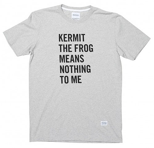
Number Three // Kermit The Frog - Supreme // T-shirt Slogan - Fashion 

Source // Supreme
I found this t-shirt which i really liked on the website of clothing company 'Supreme'. The message is quite light hearted and is linked to some of the designs that they use but it really stands out and makes you instantly think of what this could be. Even though it does not really mean anything, it grabs your attention and gets you thinking, which is exactly what the clothing company would want you to do.

Number Four  // Keep Calm and Carry On // Wartime Propaganda 


I know this is a cliche example to use but EVERYBODY has seen this poster somewhere. I love the background behind this piece of legendary propaganda, that it was used as a morale boosting slogan for the Army all those years ago. I also like how it has been adapted to this modern day and people still use it in stressful situations. 

Number Five //  Greenpeace Advertising Campaign // Charity

Source Kendrick 

A billboard advert by Greenpeace. Making extremely bold statements about the government and how they had the chance to stop climate change, yet didn't. Charity companies like Greenpeace often like to use shocking advertisements to make their message clear to the world. 


What is Graphic Design - Study Task 2 - Part 1 - Identify 5 Examples of Graphic Design Performing Different Functions

Identify 5 examples of Graphic Design performing different functions

Number One //  Minimalistic Film Posters // Posters


Source // Minimalistic Movie Posters

I love these minimalistic film posters created by various artists. I think the simplicity and subtlety of each design make them stand out from other forms of advertising. I also really like the pastel colours and textures used to create these unique pieces of design. 


Number Two // Fast Eddie's Barber Shop // Corporate Identity


I came across this on the website, Ffffound and it really stood out to me. I love the simplicity of this design and how the different types have been combined with the logo to create a really nice simple old school looking corporate identity for a barber's shop. I really like work like this as it makes the company look really proffesional, also has a contemporary look on a vintage design, making the company look like an old family barber shop but with a modern touch. I love how they have used embossing on the business cards too, which makes all the difference in it's aesthetic qualities.


Number Three //  Example - Watch The Sun Comes Up // Music Video


I hate the artist Example and despise this song but when came across this video on a music channel, the graphics really stood out to me and i had to watch it again on youtube. I think it has cleverly been edited and illustrated, looking like it has taken influence from the classic 'Aha - Take On Me' video. YES!


Number Four // Parra - Rockwell Clothing // Design For Fashion


Source // Parra 


Parra is an artist i have admired for a long time now. He runs a clothing company called 'Rockwell Clothing' and puts his minimalistic but really contemporary and colourful illustrations on clothing to get his work worn by people. He started off by making posters and posting them around his hometown of Paris, until people started to notice them and contact him for work. 

Number Five // Vintage Pharmaceutical Packaging  //Packaging Design 


Source //  Lovely Package


I have always loved and always will love vintage design in all aspects of graphics. Here are some vintage medicine packaging designs from the 1960's - 1980's that i came across on the internet a few months ago. I love the idea of looking back at how things used to be packaging and revisiting this by putting a contemporary edge on them. I really love the fonts, colours and shapes used on this packaging.


Copyright 2010. All rights reserved.

RSS Feed. This blog is proudly powered by Blogger and uses Modern Clix, a theme by Rodrigo Galindez. Modern Clix blogger template by Introblogger.