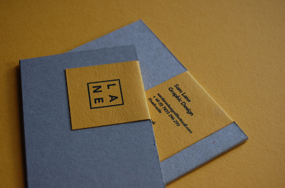
To create the business cards I wanted to use the textured stock as a backdrop for the yellow colour to sit on, as shown in my initial designs and mock ups. By doing this, it brings something a little bit different to the card itself. It also shows a trait of my work and personality and how I like to work with different stocks.
The letterhead had a pretty simple design aesthetic to it, with the information included at the bottom on the page. I wanted the yellow to be the dominant colour which would carry the brand.
The notebook is something else where the brand colours and logo can be applied and this could be easily extended in the future to various different products across a larger range both in print and web deliverables.


Leave your comment