In Today's workshop, we all brought in the 10 images that inspired us and the direction that we wanted to take our practice in. We laid them out on the table in front of us and shared our ideas about why the design is inspirational to us. We then had to, as a group of 6, list as many different categories that each piece of design may fall into. Then from that come up with more sub-catergories...
From this we then chose 10 images from the 60 that we had in front of us. These images was to be design that was the most different from everything else. This would allow us to review in the next task, a much more wider variety of design and format. We had to use this images to find out the answer to the following questions...
Questions
1. Who is the client?
2. Who is the intended audience?
3. What is it's function?
4. What is the budget?
5. Where is it from?
6. Who is the designer/studio?
Image 1 - 'Love Whoever You Goddamn Please'
1. Personal Work
2. Other Designers / Like Minded People
3. Spread a message, Inspire Others.
4. Personal Work Budget. Work created for personal use so probably quite a low budget used on stock etc.
5. Design Studio Product (www.steadyprintshop.com)
6. Steady Co.
Image 2 - 'Skarsill Ikea Tinned Mackerel Packaging'
1. Ikea Food Services
2. Ikea Customers, Food Consumers.
3. To contain fish and communicate contents is a forward thinking manner. To sell the product. Making the product look functional and affordable rather than appetising.
4. Fairly Large Budget? Sold on a large scale all around the world but from a design perspective, probably not as big a budget as putting it into production.
5. Designed in Stockholm, Sweden. Sold in Ikea, Internationally around the world.
6. Stockholm Design Lab. (www.stockholmdesignlab.se)
Image 3 - 'Flaming Lips Stage Visuals'
1. Flaming Lips (Musicians)
2. The fans of Flaming Lips
3. To enhance the audio aesthetic and create a multi-sensory experience in the environment of a music event.
4. Medium
5.
6.
Image 4 - 'Saloon Branding'
1. Saloon, A Boston Area Restaurant
2. Customers of the restaurant. More sophisticated/older audience. Very contemporary.
3. To brand the business and to give it an identity in order to make it appealing to consumers.
4. Medium
5. Boston, Summerville, MA, USA
6. Oat Creative (www.oatcreative.com)
Image 5 - '3D Wooden Mask'
1. Personal Artist Work - AJ Fosik
2. Other Creatives - Displayed in Galleries
3. Decorative, Gallery Display, To Sell.
4. Relatively Low
5. Michigan, USA
6. AJ Fosik (www.ajfosik.com)
Image 6 - 'Catalogue Zines'
1. Catalogue, Themselves. Personal Zine Work
2. Zine Collectors, 16-25 Year Old, Designers and Creatives.
3. To amuse, light hearted publication. To create a collection.
4. Low Budget, Cheap Risograph Printing on quite a small scale with limited runs.
5. Leeds, UK. But also sold internationally on a small scale.
6. Catalogue, Leeds. (www.thisiscatalogue.co.uk)
Image 7 - 'Foam Printer'
1. IFA, 2010 - Consumer Electronics.
2. The Attendees of IFA 2010, Where the product was exhibited. Creative minded people. Advertising their services to electronic consumers.
3. To advertise their product to a large scale electronic consumer audience.
4. Fairly High Budget. For the design and manufacture of the actual printer and for distribution costs and advertising.
5. Berlin, Germany.
6. Unknown
Image 8 - 'Jeremyville - Personal Illustration - T-Shirt Design'
1. Personal Illustration - Jeremy Ville
2. Threadless Customers (T-shirt Website) and fans of Jeremy Ville
3. To impress and create a personal identity.
4. Low Budget, small scale production.
5. New York City but sold Internationally.
6. Jeremy Ville - (www.jeremyville.com)
Image 9 - 'Ball Pit - Animation'
1. Cartoon Brew
2. Animation Lovers, Cartoon Brew Subscribers.
3. Personal Work created for himself and to entertain others with a similar taste.
4. Low Budget, The animation is purely digital with no production costs.
5. created in Canada but shared worldwide via internet sites and art blogs.
6. Kyle Mowart
4. Low Budget, The animation is purely digital with no production costs.
5. created in Canada but shared worldwide via internet sites and art blogs.
6. Kyle Mowart
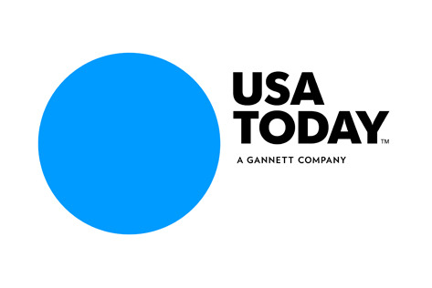
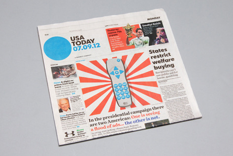
Image 10 - 'USA Today Re-design'
1. USA Today - Newspaper
2. All readers of Newspapers, In Particular USA Today
3. To present the news to the public whilst also branding the company, representing it and putting across the companies ethos.
4. Fairly High Budget. Massive company and huge production cost on a daily basis.
5. USA
6. Wolf Olins


Leave your comment