Indie/Alternative
NME (New Musical Express) Magazine

Lady Gaga, April 2011

Decemeber, 2005
Iconic Independent music magazine. The original iconic logo of the red and white block font, seen on the bottom image, was used for years throughout the rise of NME. They recently changed their logo to the same block font with no outline and change the colours for every issue. Even though this is a big decision to make, i feel the new look of the NME reflects the modern age and looks much more visually appealing than the 'celebrity gossip' style tacky font on the old magazine.
Rock/Metal
Kerrang Magazine

October, 2009
A weekly rock.alternative magazine and music channel, kerrang is massive. it is aimed around the younger generation, I'd say teenagers around 12-17. Again they use 'Grunge' type fonts to match the style of the music and also lots of different colours and fonts to grab your attention.
Metal Hammer Magazine

April, 2011
A Similar magazine to Kerrang but for slightly heavier music i think. Similar layout to the cover of kerrang though but it looks a little more busy. They use lots of different fonts, colours and badges to cram lots of information into one place and to try and grab your attention.
Pop
Smash Hits Magazine

February, 2006
The new smash hits is very different to the old. You can see how it has changed down the years with the popular culture style. Pink is the prominent colour, which suggests that this magazine is aimed primarily at young teenage girls. Again, photos and text is crammed onto the cover fighting for our attention.

January, 1986
The older smash hits magazine is much better in my opinion. The font and colours suggest a really a 80's era, which it is. Vintage Style. I really like how the 80's style is defined by this.
Top Of The Pops Magazine

Novemeber, 2010
Another generic pop magazine, using very similar colours to the newer smash hits magazine. This time pink and purple again shows how it is aimed at a young teenage girl audience.
Classical
Classical Music Magazine

Much more sophisticated looking magazine. Uses the script font which reflect the classical music. The other fonts when used in this way make the magazine look a bit boring and dated in my opinion. The mix of colours don't really work either. This magazine is definitely aimed at an older audeience. I would say around 40-60. there doesn't look to be any enthusiasm for modern design at all here which is disappointing. Looks really cheap in my eyes.
BBC Music Magazine

February, 2010
i like this magazine better than the first one. The title and font at the top suggests that is a little bit more contemporary, even though its still focussing on the serious tone of classical music. The other font looks a little bit better organised and much more classy as well as being more contemporary for this modern day. The photograph also has been shot better and really makes the cover interesting.
Hip Hop
XXL Magazine

April, 2008
I like the logo for this magazine. The red on white 'XXL'. this is started to become a bit of a fad now and is something that people associate with the 'Hip-Hop' culture which makes it relevant. They often use big photo's on the front cover to make the artist stand out more as well as 'grimey' font to fit the overall theme of it.

October, 2007
The Source Magazine ' The Bible Of Hip-Hop'

July, 2008

April, 2008
Similarly to the 'XXL' magazine, 'The Source' magazine uses a red, black and white colour scheme. i haven't really notice before but these colours are associated with the 'Hip-Hop' scene. In my opinion, this magazine doesn't quite look as classy as the 'XXL' magazine but still appeals to the same audience.
Chart
Rolling Stone Magazine

April 2011

March, 2011
Rolling Stone is an iconic 'Chart' and 'Popular' music magazine. It originally started of as a 'Rock' magazine but has slowly become more and more mainstream. The title font logo at the top has remained the same throughout the many years and this is instantly recognisable and iconic. The magazine looks quite classy. Not too many fonts used and nicely laid out. clean cut.
Q Magazine

January, 2011

1986
Q magazine again is pretty iconic. The instantly recognisable symbol today is the white 'Q' int he red box but this slightly altered with different colours throughout the crazy stage of the '80's'. The magazine looks pretty modern, uses a mix of fonts on the front still to grab your attention.
House/Dance/Techno
MixMag

December, 2010

July, 2009
Mixmag uses a font for the logo and colours to appeal to the audience. The audience would be sort of older teenagers and young adults that are into that scene.
Fact Magazine

April, 2007
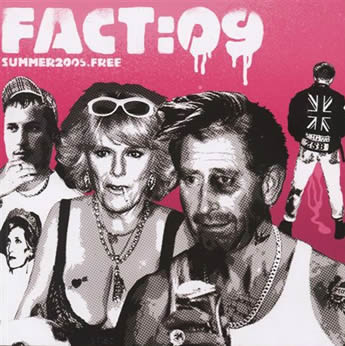
summer, 2009
FACT is a house/techno music weekly magazine. Often has quite contemporary art on the front cover which is good for the audience it is aimed at.
Technical
Computer Music Magazine

June, 2011
Sound On Sound Music Recording Magazine

July, 2009
Technical magazines about music a recording. Top one has a bit more thought put into the design of it. I really like the illustrations of the indtrucments. It actually looks more contemporary and that it might be aimed at a younger audience. The bottom one looks dated and quite frankly boring. not my cup of tea. looks like it may be aimed at an older audience.
Western
The Western Way

BlueGrass

July, 1969

June,1968
Some old school western blues and grass country music magazines. I really love the old ones, the illustrations and vintage photos mixed together but this would have been modern back in the day. Still a really cool traditional style.

Leave your comment