Archives

OUGD502 - Final Website - Coded

Today I managed to get my website coded properly. I had to take a slightly different approach than my original concept just for the meantime. I needed to create something that I was capable of coding myself for now, before I may outsource for a better one in the future.


The conept for this was simple. I wanted a yellow nav bar the the bottom left of the page with a full bleed slideshow of images in the background.


The website folder has the three pages in there. Home (Index), About and Contact. There is also three more links in the nav bar which is to twitter and behance and a interactive PDF which pops up. 


Here is the image folder for the website. It contains all the buttons as separate images and for the rollover images and also all the images for the moveable slideshow in the background. 


Working with screen sizes


I found the javascript for the slideshow which meant that the website would work on different sized screen with the optimum being 1980 x 2000 pixels.


13" Screen


22" Imac


The about and contact pages are boxes that flip up from the nav bar then close when you click back on home. 


As I haven't bought a domain yet, the website isn't live, but i;m planning on making it live over the next few days...


OUGD502 - Self Branding - Printed Products

The Final range of initial printed stationary includes the letterhead, business cards and moleskine notebook;


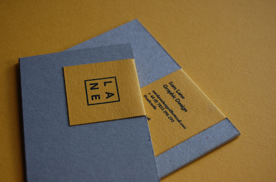
To create the business cards I wanted to use the textured stock as a backdrop for the yellow colour to sit on, as shown in my initial designs and mock ups. By doing this, it brings something a little bit different to the card itself. It also shows a trait of my work and personality and how I like to work with different stocks. 


The letterhead had a pretty simple design aesthetic to it, with the information included at the bottom on the page. I wanted the yellow to be the dominant colour which would carry the brand. 


The notebook is something else where the brand colours and logo can be applied and this could be easily extended in the future to various different products across a larger range both in print and web deliverables. 


OUGD502 - Self Branding - Online Presence

I started to apply the brand across my online identity to see how it would work and function, successful or unsuccessful...


Behance


Twitter


Facebook


Tumblr


Cargo


OUGD502 - Self Branding - Website

I decided to mock up a website by applying my new branding. I will hopefully get chance to build this website, but the style is something I have never created before. I need to find javascript that will allow me to slideshow fullscreen images as well as scroll through each project.


Homepage


The homepage will follow the logo that is used throughout my branding. There will be the square logo over the image i have decided to use alongside the brand, which is one of my dad. The square covers the face adding a element of mystery behind the person in the image. 


As you can see from this close up, the three pieces of text will remain at the bottom of the webpage consistently throughout the website. The first stating 'Sam Lane Graphic Design', and the next two being my email and phone number. The email will pop up with a separate box to drop me an email when clicked. 


As you can see from this transition slide here, as you scroll down through the website, projects appear one by one. A full screen image brings the impact of each project and the black and white keeps the theme running consistently, relating to the whole yellow. black and white branding. 


Projects


Here you can see an example of a project when the webpage has been scrolled down from the homepage. This can be controlled by simply moving the mouse wheel / trackpad down or if you use the arrow keys, it will jump quicker through each project. 


As you can see now from the images above, we have arrow keys in the centre of the page on the left and right of the image. These are what control the images that belong to the project. These can be controlled by simply clicking on these icons, or again using the arrow keys for a quicker response.


Heres a close up screenshot of the arrow icons. These are clean rounded lines which relate to the brand and typeface used throughout. The yellow also stands out well enough on both a white and black background which will be the photographs of the projects. 


Information 


Looking at a close up of the same page on the Bacardi project, you can see the link at the top of the page. This will stay there consistently throughout all the projects and is a quick link to more information about me as a designer. When this is clicked, it will bring a large yellow section that drops over the project image. This will remain here and can be minimised by clicking the 'hide me' link at the bottom.


Here you can see how this will look. This opens on the 'about me' section which has a simple paragraph explaining who I am and what I do...

"Sam Lane is a Graphic Designer and all round creative thinker, with a strong focus on branding and editorial design.  He works in both commercial and non-commerical realms of design,and is always open to collaberate, so get in touch for enquiries. Each client and project requires a different approach and process.  Sam realises this by offering the diverse skill set and creative network required to deliver intelligent and dynamic outcomes."


This close up shows the type in more detail. There are 5 links at the top of this section with information about myself. These are the About section, Services I have to offer, my CV, Contact details and a link to sign up to my monthly newsletter. 


Information Pages

 The separate pages in the information box are shown here in order ; Services, CV, Contact & Newsletter


Services I offer including a focus on Branding, Identity and Publication.


CV. This includes Education, Experience, Exhibitions and Selected Clients. 


Contact. A Link out to my email and my phone number accompanied by more links out to other places on the internet you can find me. 


A simple text box to type in your email address to sign up to the monthly newsletter. This updates people on projects I have been working on as well as part of my lifestyle. 


Other Projects / Website Movement

Examples of the movement of the website and how some of my other projects might be displayed across the scrolling website...


Bottom Page


When the projects come to and end, The last image will move into a bright yellow screen of the brand. This will leave the user with a bold statement to finish on. This will be accompanied by the 'lane' logo in the centre of the page. The type at the top and bottom of the page will now turn black to contrast with the yellow.


Moving Gif 


You can see by this moving gif how the website will function, using the scrolling down technique to move through projects, the arrow keys to flip through images in each project and the link at the top to bring down the yellow box of information about me and the projects...


Sam Website

OUGD502 - Self Branding - Logo, Identity & Stationary


Logo Development


I tried to create a more contemporary looking logo, which added a little bit. In the end, I realised this was a little bit too stylistic and not really true to type of Graphic Design that I'm creating. I'm quite a contemporary designer, but like to think that I'm not just a one trick pony with the Northern European style designs. This is why I stripped it back to the basics. The clean cut square with the four letterforms inside.

I also experimented with some different typefaces before finally selecting the chosen typeface in Avenire. 

You can see more of these experimentations in this scribd document below;-


Final Logo


I slightly adjusted the alignment of the letterforms so that the logo was easier to look at visually. The alignment of the 'A' and the 'E' now fit much better together 


Logo x Imagery


I found that the logo works brilliantly over black and white imagery, tying in with the theme. I used this old picture of my dad as part of the initial branding, but you can also see how the colour and different shapes can work over any black and white imagery relating to my work or lifestyle.


Stationary Set


Business Cards 


I wanted the business cards to be different to anything else that i've seen before. I also wanted the person who received it to get a sense of worth when they held it or looked at it. I thought I could achieve this by carefully selected the stock, the weight of the stock and the finishes to add a really tactile and luxurious element to the cards that will make someone want to keep it but also give them a sense of the style of design i create.

 I think these designs do both. I like the idea of using the pulp finish of the stock, real thickness, with the addition of the yellow stock sticker taped over the edge of the card and also maybe and embossed finish.


Letterhead


I applied my brand across various different pieces of stationary starting with a letterhead. I wanted to keep this simple and following the theme of my website, used the type aligned to the bottom of the page with the logo on the right. 


Moleskine / Notebook


The logo is easily applied to a moleskine and notebook through the bright colour scheme. Central alignment of the logo tends to work best. 


Stationary


Ipad / Iphone


Copyright 2010. All rights reserved.

RSS Feed. This blog is proudly powered by Blogger and uses Modern Clix, a theme by Rodrigo Galindez. Modern Clix blogger template by Introblogger.